Try them live
The stack is tunnelled for remote review. First visit shows an ngrok confirmation page — click Visit Site once and you are in. No login needed; this review covers the landing page only.
| Route | Template | Taste in one line |
|---|---|---|
| /1 | Aurora | Gradient-modern SaaS — soft, rounded, energetic |
| /2 | Editorial | Serif magazine — prestigious, calm, institutional |
| /3 | Summit | Corporate trust-first — dense, confident, B2B-safe |
| /4 | Bento | Playful mosaic — friendly tiles, consumer energy |
| /5 | Nocturne | Premium dark — exclusive, dramatic, high-contrast |
What is tenant-configurable
Every template consumes the same data contract, so a tenant switches templates without touching content:
| Knob | Source | Effect |
|---|---|---|
| Brand colors | branding.colors.primary / secondary | Derived into the full token set (base, hover, tinted surface, readable foreground) — every accent in every template follows |
| Hero image | branding.hero_image_url | Hero artwork; each template adapts its layout when unset |
| All text | landing.* | Hero copy + CTA, announcement, 4 stats, 6 highlights, about band, achievements band, featured course slugs |
| Contact | links.* | Phone, email, address block |
Sections self-hide when their data is empty, so a half-configured tenant still gets a coherent page. The section set is fixed for this iteration.
A soft layered gradient hero built from the tenant's primary and secondary colors, a floating rounded hero image, and glassy stat chips overlapping the hero edge. Elevated highlight cards with tinted icon squircles and pill CTAs. Reads as a modern consumer-tech product: warm, energetic, optimistic.
- Brand gradient hero
- Glassy stat chips
- Pill CTAs
- Rounded cards
- Best for: bootcamps, creator academies
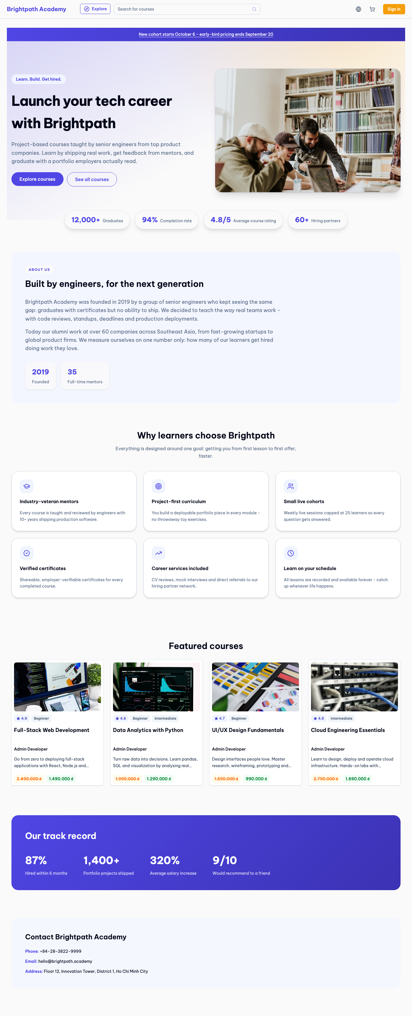

A big serif display headline, letterspaced eyebrows, a 7/5 split hero with an offset-framed image, and thin rules between sections. Highlights become a numbered list (01–06) and stats render as large serif numerals. Brand color is used sparingly — links, CTA, eyebrows — so the page feels like a prestigious institution rather than a startup.
- Serif display type
- Numbered highlights
- Thin rules
- Restrained color
- Best for: universities, executive education
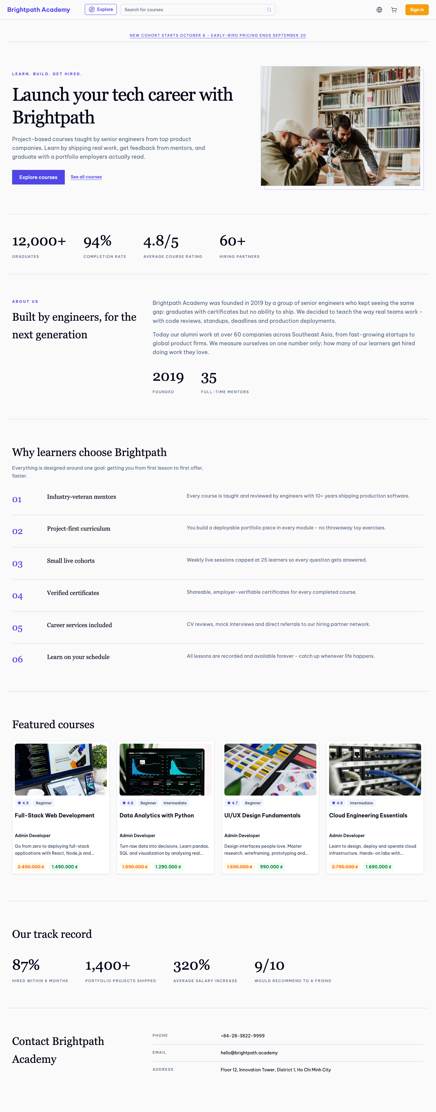

A conventional but polished B2B layout: left-aligned hero copy with a primary/outline CTA pair, a captioned hero image card, and a solid brand-color stat band directly under the hero. Checklist-style highlights, a sticky-title about band, and a clearly labeled contact card. Dense, confident, and safe — nothing surprises, everything reassures.
- Solid stat band
- CTA pair
- Checklist highlights
- Sticky about title
- Best for: corporate training, B2B partners
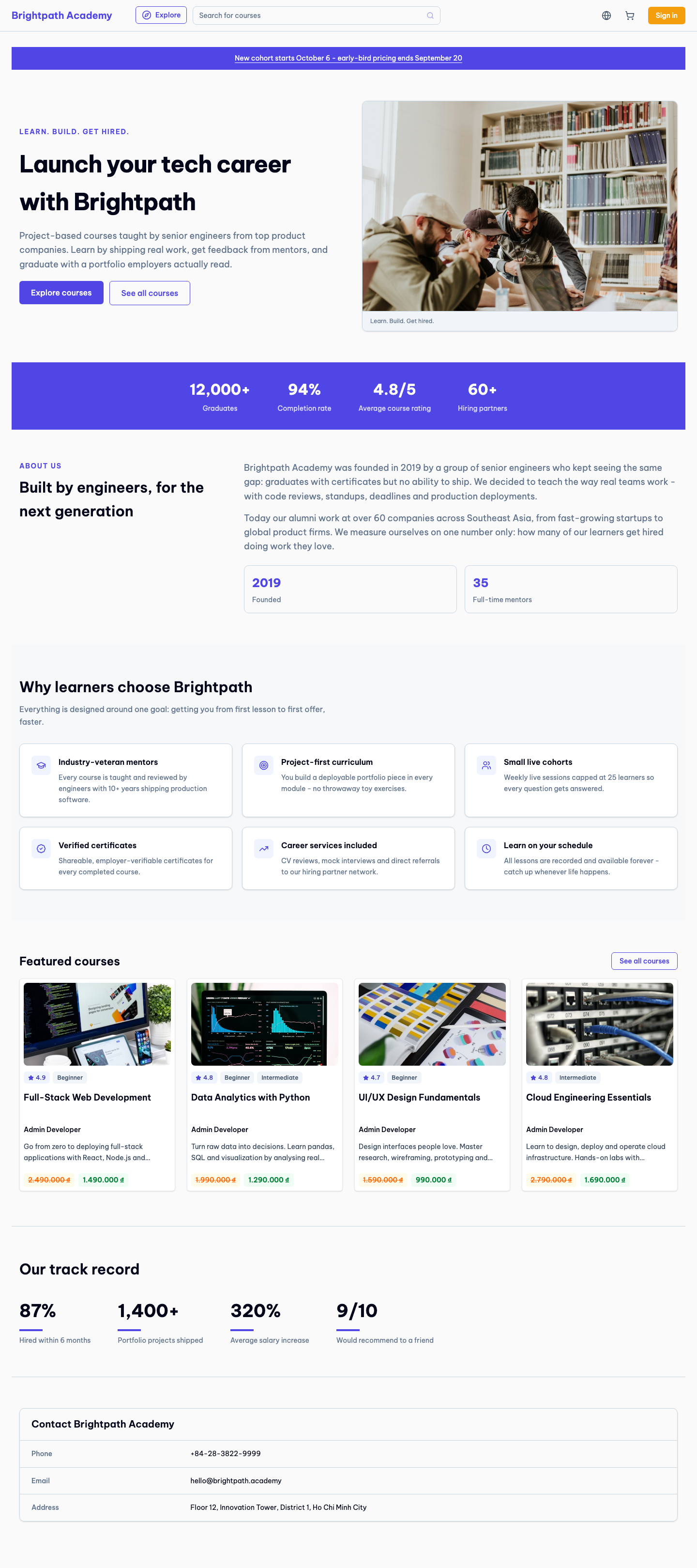

The hero is a bento grid: headline tile, image tile, announcement tile, and individual stat tiles in mixed tinted surfaces, with a slight hover lift on each. Chunky pill buttons, chip-style eyebrows, and colorful bordered highlight tiles carry the language through the page. Friendly and energetic, aimed at consumer and creator audiences.
- Bento hero grid
- Tinted tiles
- Hover motion
- Chip labels
- Best for: consumer skills, youth audiences
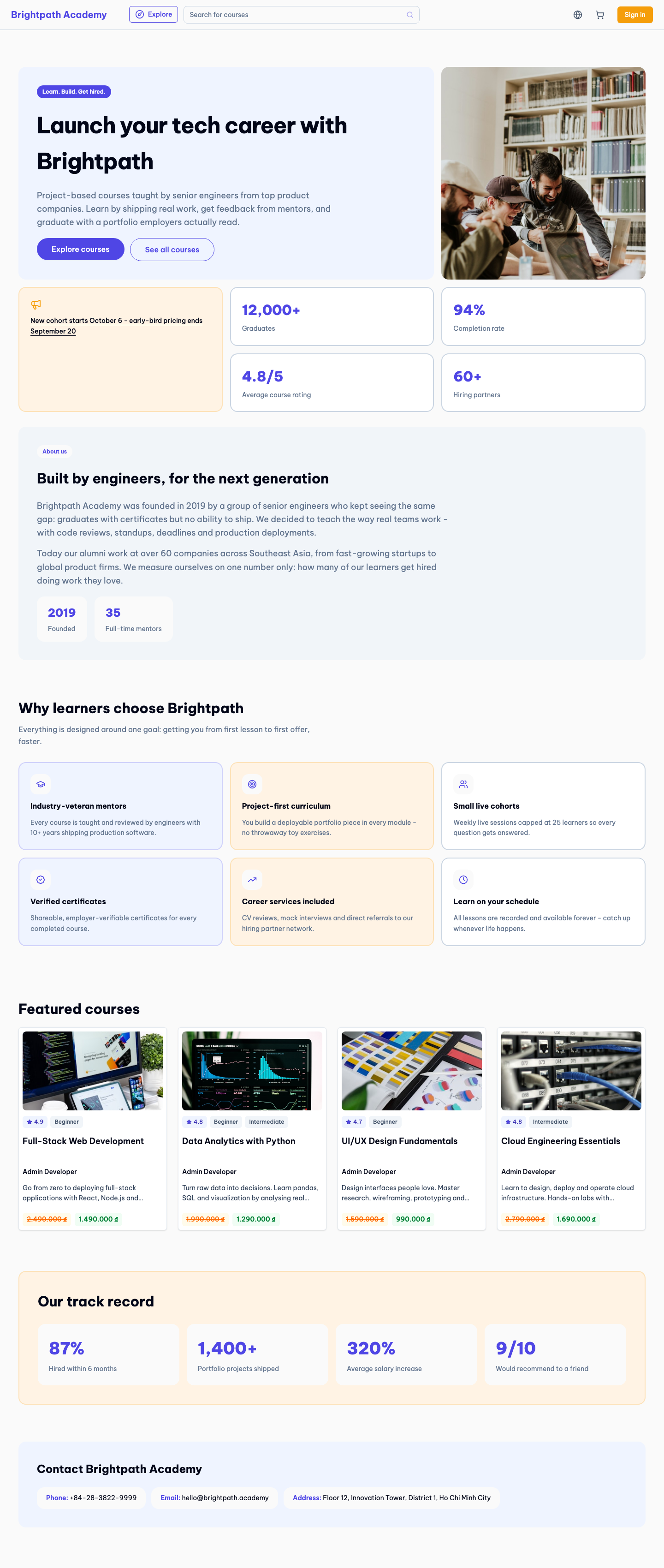

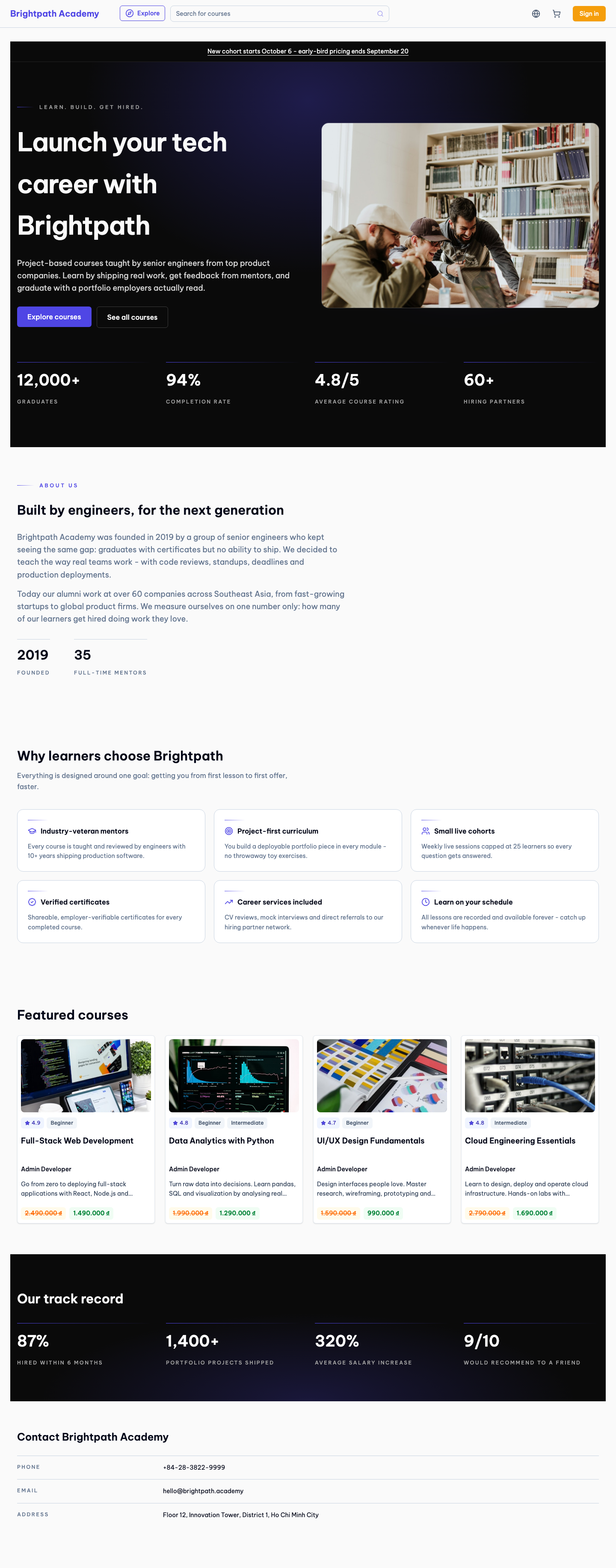
Hero and achievements sit on near-black with a radial brand-color glow behind the headline; body sections stay light, creating a dark–light–dark rhythm. Luminous accent lines, uppercase micro-labels, and understated CTAs. Feels premium and exclusive — a statement page for tenants that want gravity.
- Dark hero + glow
- Light body rhythm
- Luminous accents
- Micro-labels
- Best for: premium brands, finance/tech academies

Baseline: the current shared template
What non-default tenants render today, shown with the same Brightpath data for comparison.
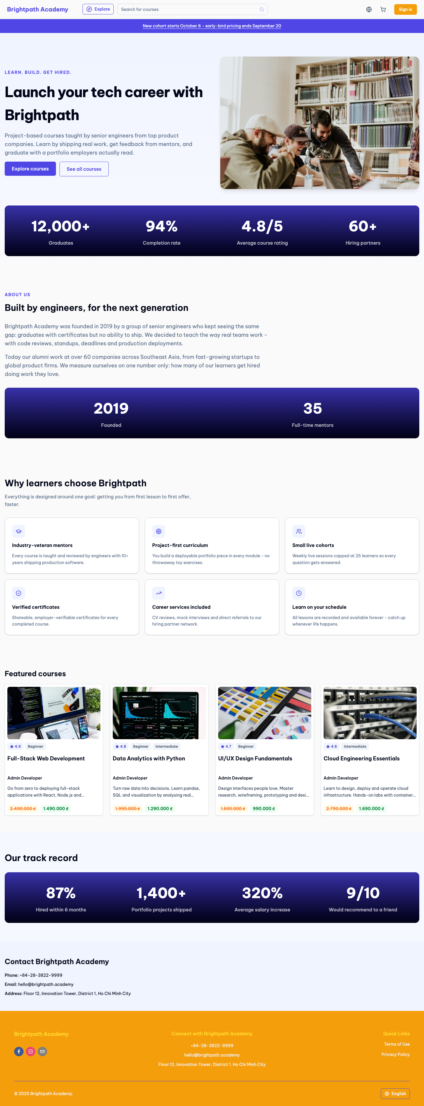
What we want feedback on
- Ranking: which template should become the default shared template, and which (if any) are worth keeping as selectable options?
- Selling power: does the hero + highlights combination read as a pitch for the tenant, or as a generic LMS page?
- Brand fit range: pick a tenant you know — would their colors and imagery work in your preferred template?
- Section set: anything missing that a tenant would ask for on day one (testimonials, pricing, FAQ)?
- Mobile: check /1–/5 on your phone through the same links.